The Salt Company
Brand Guidelines
updated april 10, 2024


A cohesive visual identity serves to connect students to both the local and national community of Salt Company, while linking new ministries to the existing national organization.
Our hope is that it reduces the burden on church plants to develop new branding while also serving as a helpful tool for existing Salt Companys. It offers clear guidelines, helpful suggestions, and examples for effective implementation within your Salt Company.

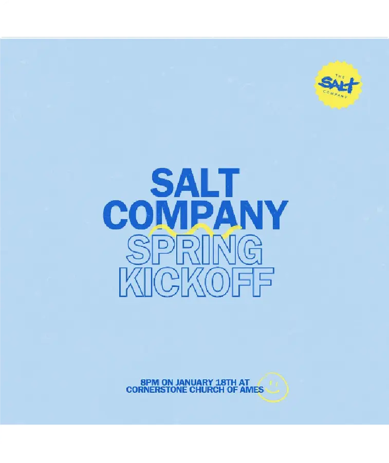
The logo MUST be a solid color on a simple background for all social media profile images. Feel free to use your school colors.


Use the width of “THE” from the logo to ensure the logo has enough negative or white space. No other information should be in this space.
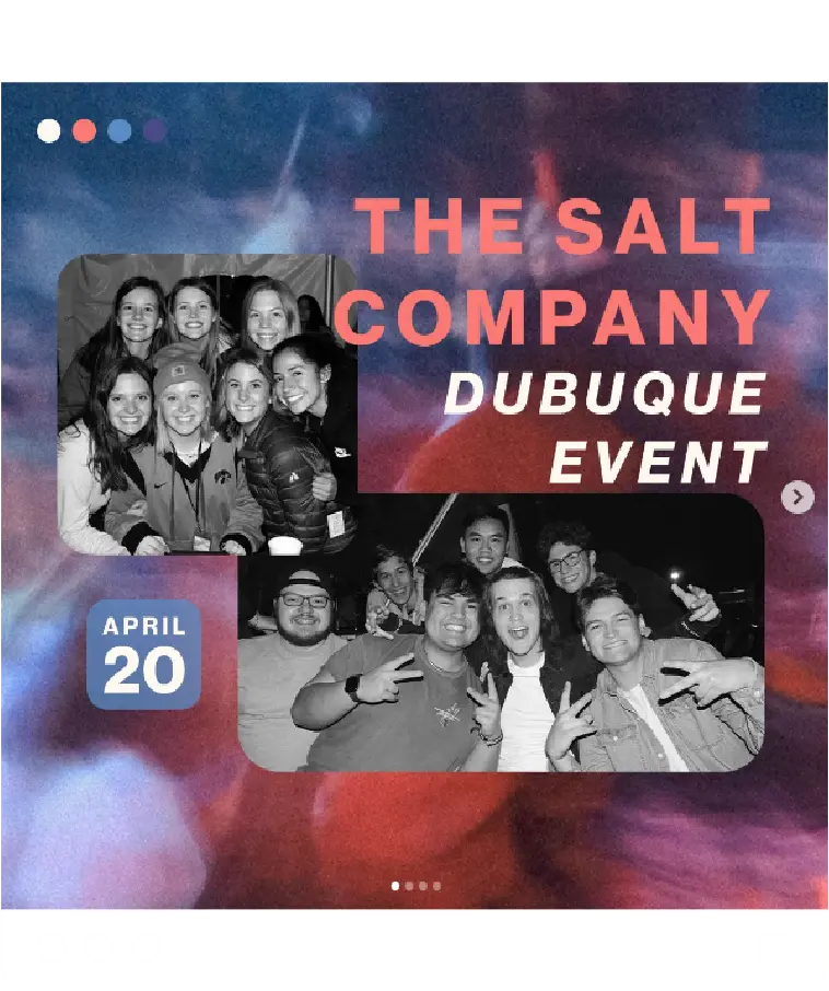
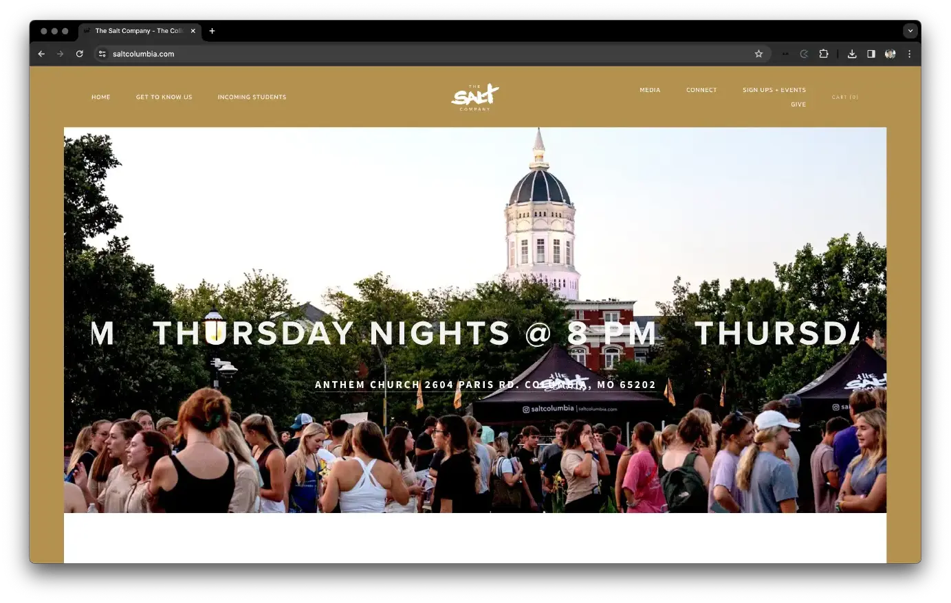
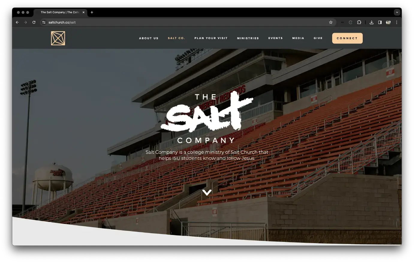
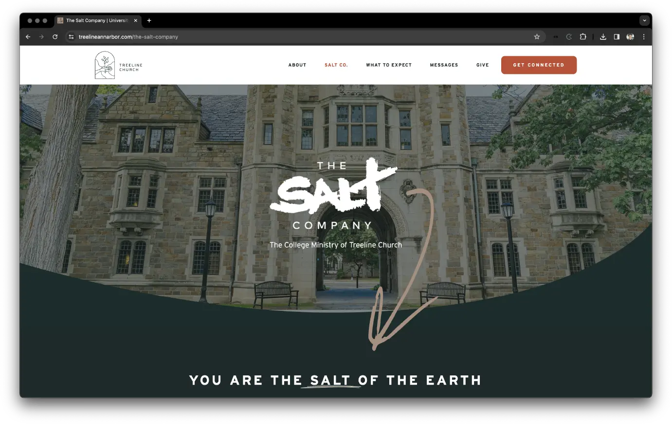
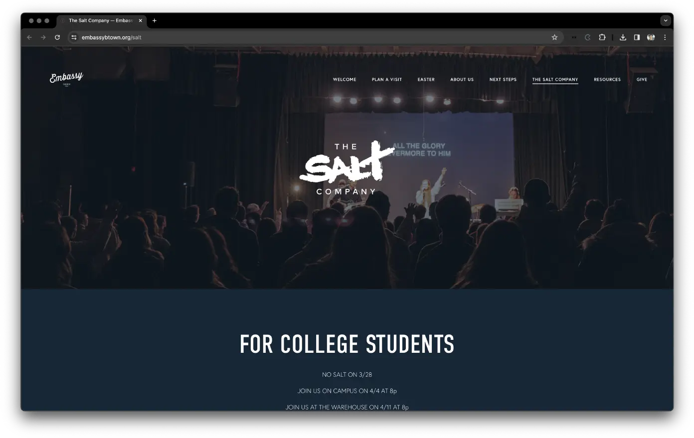
These logo guidelines are especially important for your website, social media, signage and printed pamphlets.
The original logo was painted on a bed sheet by a student leader in 1987 for the first Salt Company outdoor kickoff. Since then, we have used a digital version of the original painted logo until "THE" and "COMPANY" were updated with Mark Pro in 2020.

If you are going to use multiple weights please do so sparingly and consistently.
For reference, “THE” and “COMPANY” in the logo are set in Mark Pro Medium.
Title Case
Plural
Limit these abbreviations

They will hopefully serve as helpful guidance or suggestions instead of mandatory rules.
Each Salt Company is unique and our desire is for that diversity to come through while also supporting the cohesiveness of the national identity.


If you have any questions or would like further clarification please contact communications@thesaltnetwork.com